
Responsive Design – Case study
Click here to see the designs.
Design process
I watched many tutorials on how to use Figma since it’s the first time I used it for a project. Figma interface is quite similar to Adobe XD so I did not have a hard time learning it. I decided to work with iOS app and made sure to follow Apple Guideline. After finishing the app design, I moved forward to working on the iPad version of the app. iPhones and iPads has similar look so it was not a hard transition between the two platforms. Designing websites is quite different than designing apps. I wanted to keep the consistent look and feel between them so I tried to use the same design elements across different platforms. I gathered feedbacks for the initial designs and kept working on finishing my designs. After finishing design individual screens, I went ahead and create a prototype to see how it would work and fix any error occurs on the way. It is a back and forth process that requires lot of small adjustments to make sure the apps and the website work the way I want.
Design Research


Personas:
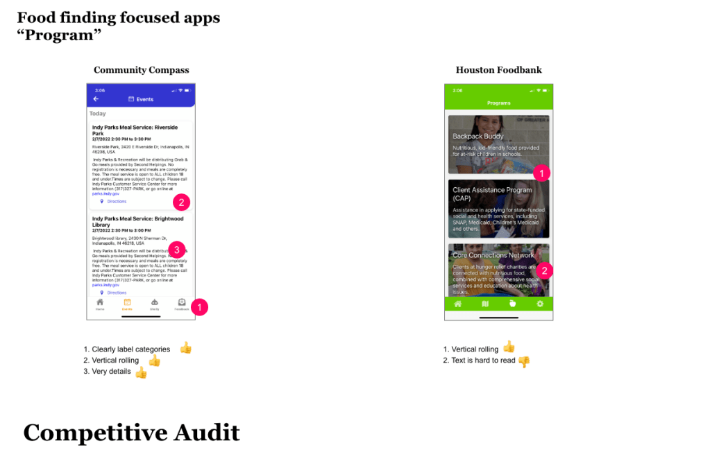
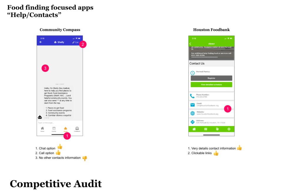
1. People who are low income (generally under $20,000/year) who has food insecurity need and/or financial struggles.
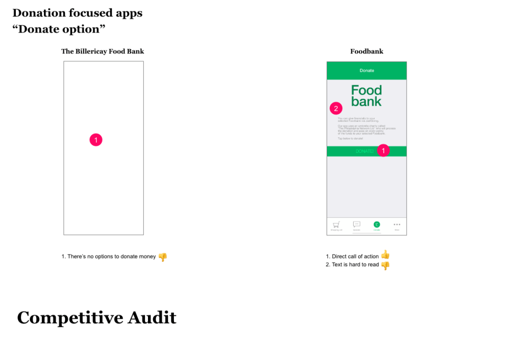
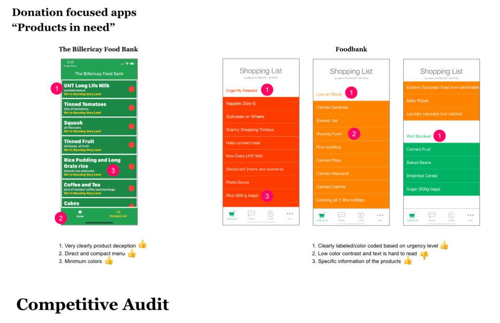
2. People who have excessive amount of food and want to donate or people who want to donate money to a food bank.
 Mimi Nguyen's Design